
Colors in interior
Each color in your interior has associated psychological effects. Decades of research confirm that some colors consistently evoke certain emotional responses.
Red
Red is the color of power, aggression, and passion. It also triggers the appetite (which is why it is such a popular color in restaurants.) Red is a warm color, which means red accents can heat up the space quickly. However, red is also associated with anger and control. Incorporating too much red in the home can make people feel anxious or unsettled, so use it sparingly if you’re trying to achieve a calming effect.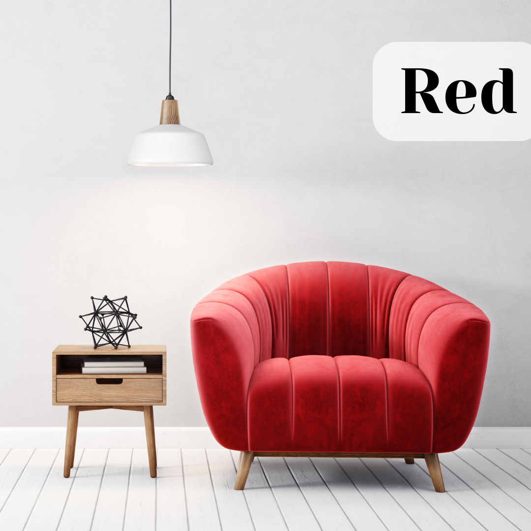
Orange
Orange is associated with energy, sports, competition, and innovation. Orange is such an energetic color that it is rarely used as a dominant color in home design. It is more often seen in office settings and sports facilities. It’s not the color to use if you’re trying to create a serene space, but when skillfully incorporated into your interior design, orange can serve as a cheerful mood lifter.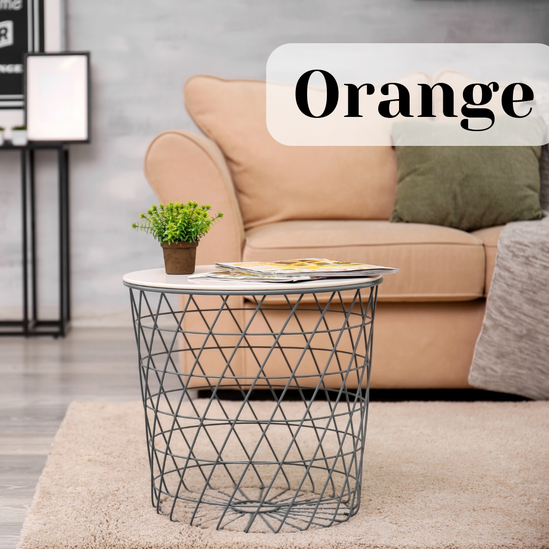
Yellow
Yellow is the only warm color associated with relaxation. It is associated with happiness, creativity, and innocence. Because yellow is also associated with nurturing, it is often featured in kitchens, children’s rooms, and private areas of the home. Less saturated yellows also work well with neutrals to create a relaxing effect.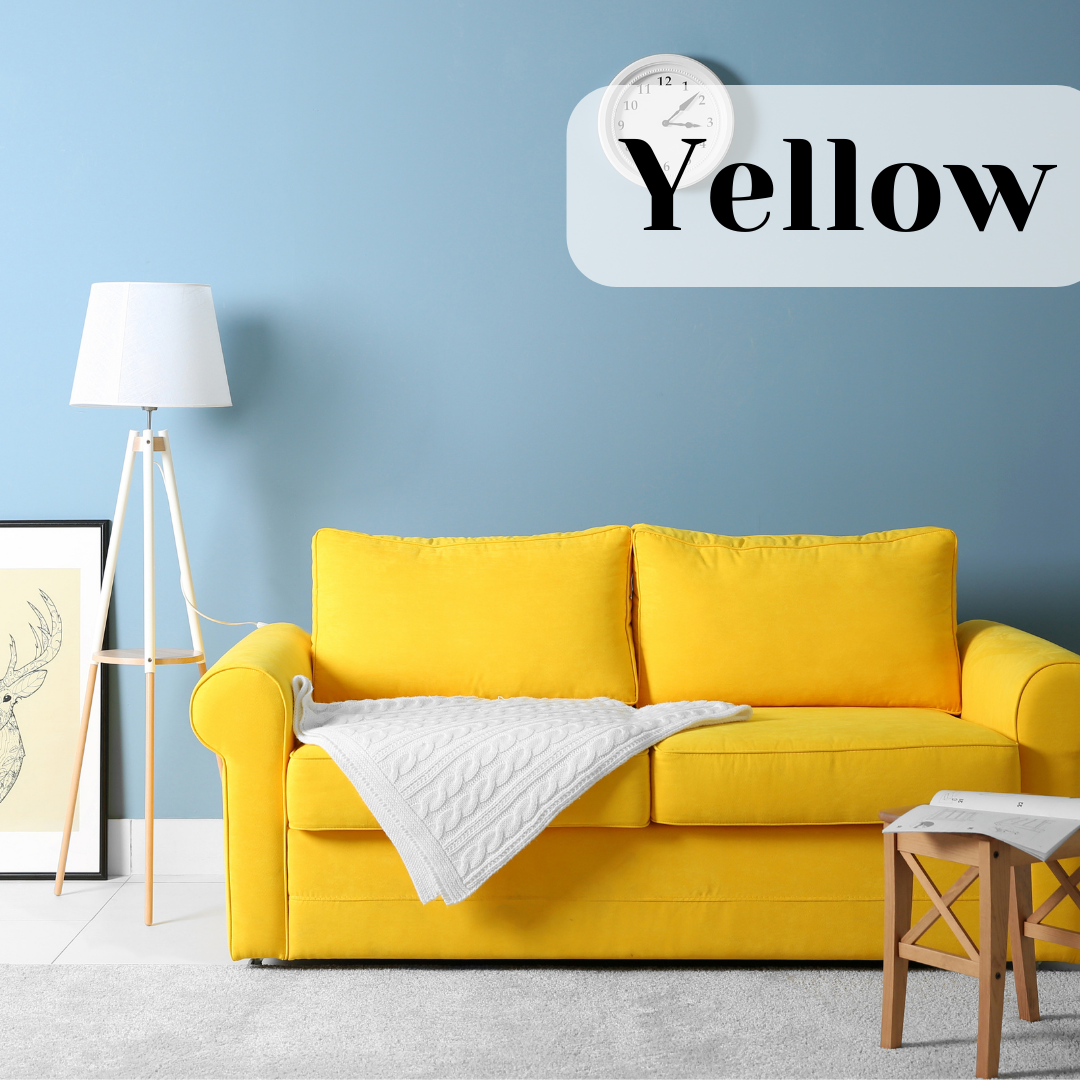
Green
Green is a soothing, calming color. It is associated with balance, harmony, and nature. It is also the color of growth and renewal. Green is often used in professional settings to help occupants feel calmer. That’s why actors waiting to appear on TV are kept in a “green room.” In homes, green can create a serene feeling that soothes and calms. Grey-ish greens, sage tones, or khakis often read as a neutral color, and help create a relaxing space.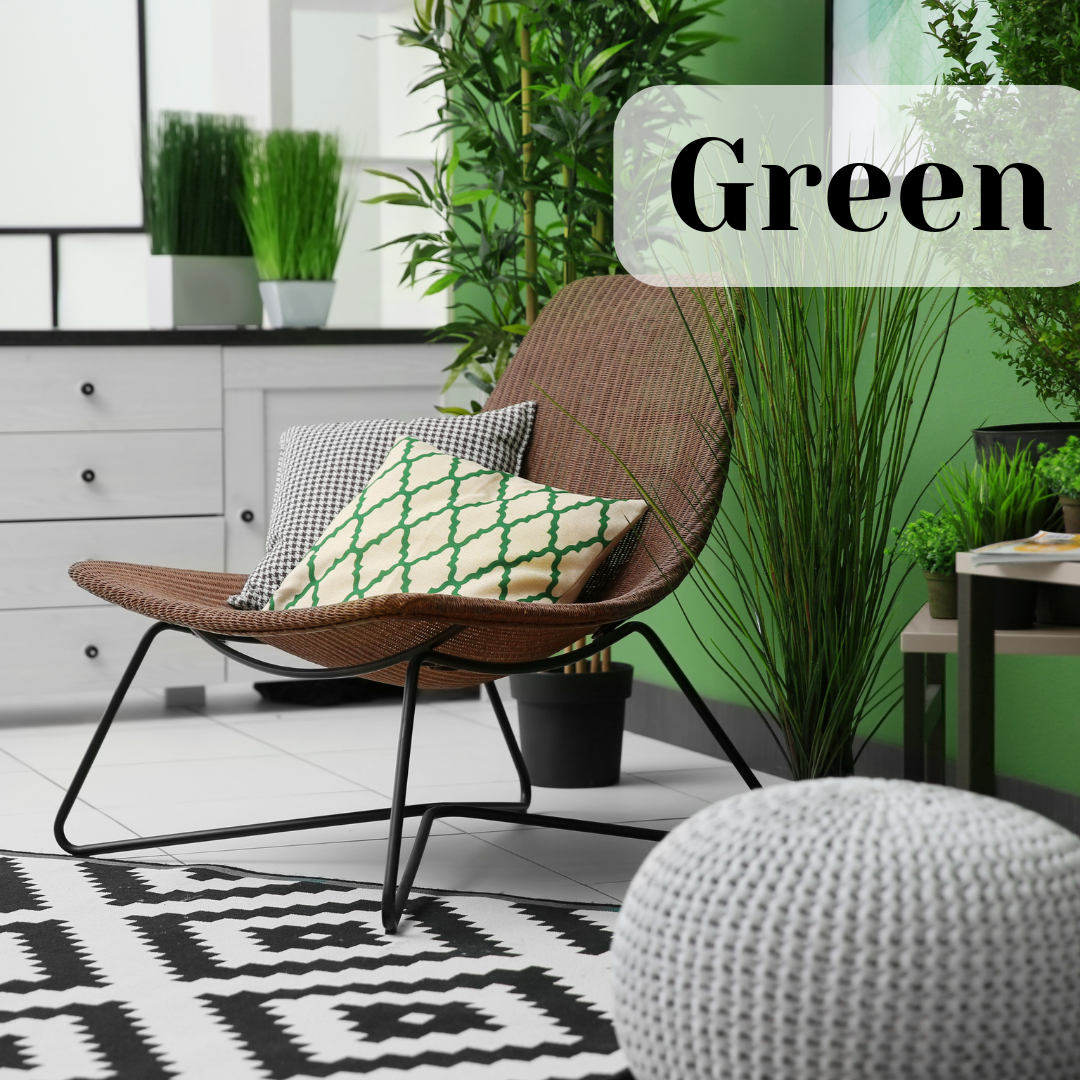
Blue
This is a color that communicates fresh, calm, serenity. It’s popular in health offices and financial institutions. However, saturated blues can evoke oceans and water, and work very well beside bright whites. Finally, research shows that blue is one of the least appetizing colors, which may be why it’s used less often in kitchens and restaurants.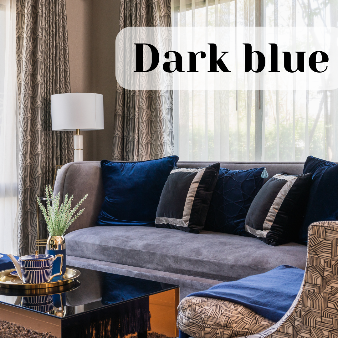
Purple
This is an indulgent color that evokes feelings of luxury, privilege, and specialness. In a home, the use of purple is unusual, which makes it a striking statement. Pale purples, or lavender, is considered feminine, soft, and comforting.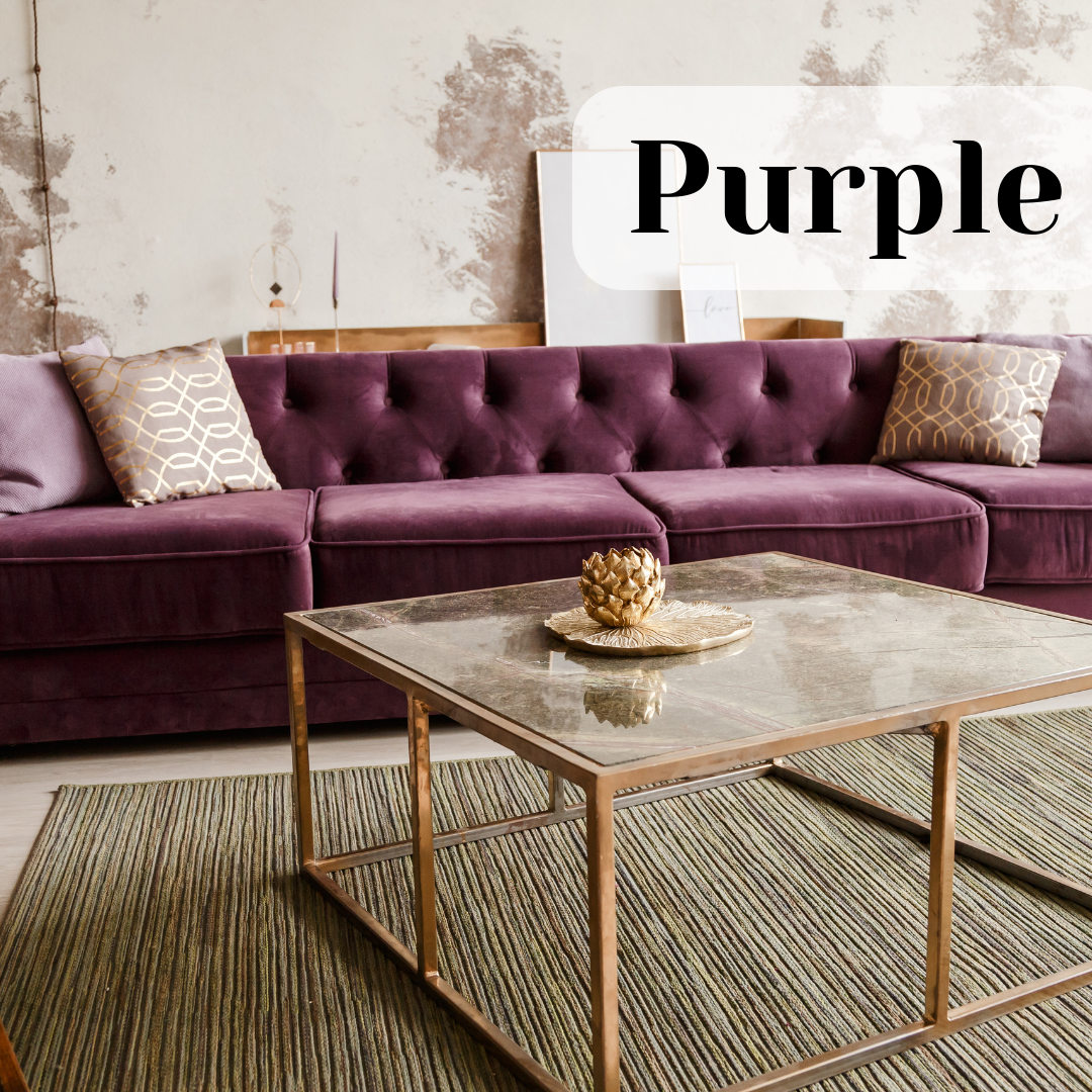
Grey
When appropriately used, grey accents in home design can create neutrality and balance. In a modern interior, grey makes a great combination with white or beige and creates a neutral background for decorating.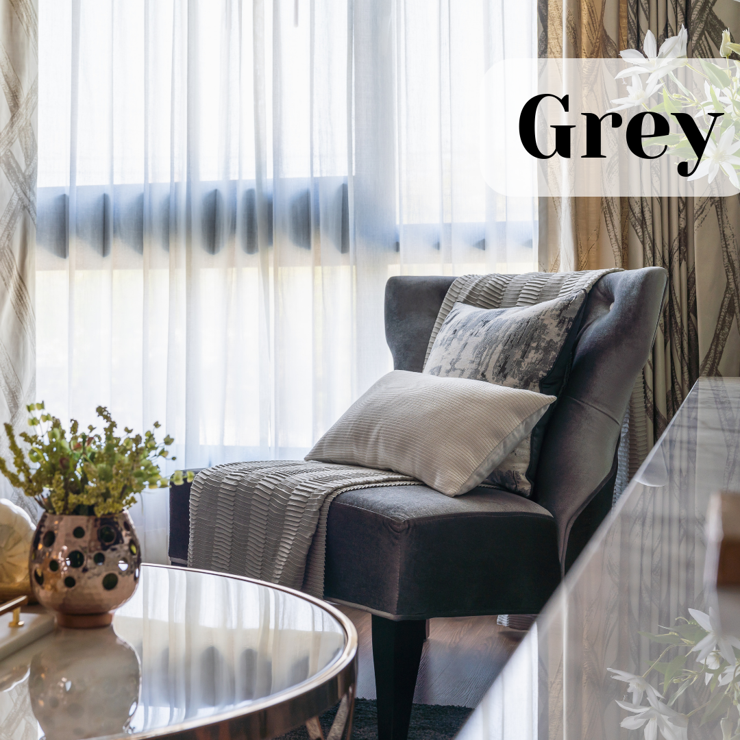
Brown
Brown is a color often found in nature. Studies show the use of brown in a home evokes feelings of strength and reliability. Using brown in a room can create a sense of dependability, security, and safety. Brown is present in many rooms as a part of wood furniture or wooden cabinets. Combining browns with greens, whites, and neutrals is an effective way to create a serene, cheerful space.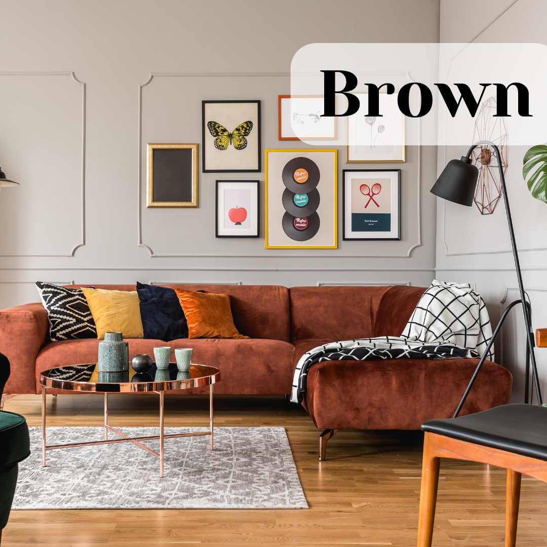
Black
Black is not a cheerful color, so it’s usually used as an accent. When used sparingly, black elements can create calming harmony and balance in a room. Liberal use of black can also make an area look powerful, dramatic, or important.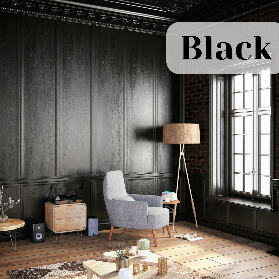
White
White is a neutral color that is common in most homes. White reflects light, making rooms feel brighter, more spacious, and bigger. It also evokes feelings of cleanliness, purity, and innocence. It is an easy color to work within interior design. White provides a practical background for statement pieces like artwork or sculptures, which is why so many museums have white walls.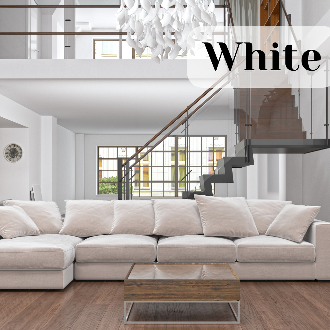
GOS, 2022.
